 The TI-Nspire CX & CBR 2 The TI-Nspire CX & CBR 2 Solving linear inequalities in class had easily become a mundane topic to me. Students' prior knowledge was good, although they struggled a bit when the discussion changed to include absolute value inequalities.
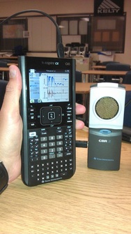
"Why is it so important we're able to phrase the distance from an object like that?" I had heard on several occasions. I DID have access to a Texas Instruments TI-Nspire CX as well as their CBR 2 (Calculator-Based Ranger), which had been useful in the past with a ball bounce lab and I fully intend this school year to do the Bungee-Jumping Barbie lesson. With CBR 2 and TI-Nspire CX in hand, I began to collect data in the hallway outside my classroom during a passing period with students walking by at a variety of distances away from the sensor. This was insightful, but did little to give relevance to the idea of absolute value inequalities as I had set out to do.
So after thoroughly banging my head against the drawing board, so to speak, I decided to relate the back-up sensor (and camera) on an automobile to the compound inequalities and absolute value equations we had been investigating earlier in the week.
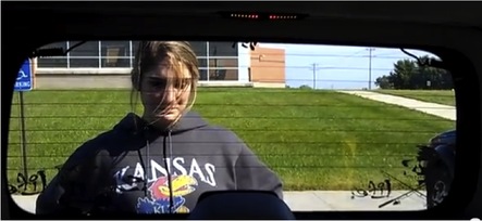 She seems to have a lot of faith in my backing skills, huh? She seems to have a lot of faith in my backing skills, huh? After searching far and wide to find a teacher's vehicle new enough to include a back-up sensor system, I then found two "willing" students to help me stage and record an example of the alarm system at work, with visible warning lights above the rear window in the photo shown). We -- er, actually, I -- backed the vehicle towards our volunteer (pictured here, seen through the vehicle's back window, exercising every ounce of trust she can muster up) and measured her distance to the sensor when it changed intensity and/or volume. The video was simple enough to capture, so I uploaded it to YouTube HERE, if you feel the need to use it in 3-Act-Math format (and because I always enjoy working a Dan Meyer shout-out into a blog post). My intent was to use the video clip as an Act 1, then the photo below for Act 2 to include some accompanying details and measurements. I have not managed, at this time, to accumulate the necessary camera shots for an Act 3, but hope I can do so in the not-too-distant future.
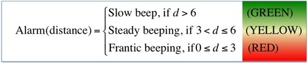
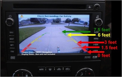 Image reflects data collected from observed alarm-distance relationship. Image reflects data collected from observed alarm-distance relationship. I found a screenshot of the new backup sensor/camera system available for the new Chevy Silverado and labeled its colored guidance lines to correspond with the observed distances when the audible and visible alarm system was set off during our trials. The prompt I gave students was that they needed to be able to provide enough information about the inequalities associated with each tone, so that we could construct a "poor-man's vehicle backing system." To be fair, earlier in the week, we had created several of our own programs to use with the TI-84 Plus (now available in the TI-84 Plus C with color screen and rechargeable battery, which I've grown to appreciate quickly) calculators, including Quadratic Formula, Distance Formula, Slope Formula, and Midpoint Formula programs. I aim to include links to these files as soon as my school webpage editor is properly troubleshot. For now, you may browse my classroom webpage using THIS link. While this particular prompt may not fit the ideals for the Common Core State Standards for Mathematics, I feel it does give some worthwhile insight into how computer programming logic has a place in a vital component of vehicle safety systems. Sometimes, this sort of insight is enough to squelch the "But when am I ever going to USE THIS STUFF in real life?" questioning that can occur frequently with math topics.
 If using the 3-Act Math format, this could serve as Act 3 for the time being. Sorry. If using the 3-Act Math format, this could serve as Act 3 for the time being. Sorry. The relationship I had hoped students would construct, or at least mimic, in their analysis of the video clip I created and the accompanying photo shown above.
Most importantly, I wanted to see that students had the wherewithal (yes, I used "wherewithal" in context on a math blog entry) to only include, for example, "6 feet" as part of a single interval instead of assigning it to more than one interval. My hopes in this was to have some sort of reinforcing example to refer to when we begin our look at functions and how each input value can only have one output value.
With this sort of application to the simple, compound, and absolute value linear inequalities we have used this unit, I hope that my students have some sort of foundation or respect for how this topic is relevant and useful in real life. The female student in the video seems pretty bold to stand firm, knowing that I'm backing up straight towards her and, truth be told, there was a Counselor's meeting going on while we were filming in the conference room directly behind her. So, I had some explaining to do when I ran across a couple of those counselors towards the end of the school day, but did get some head nodding and encouragement that the lesson potential for what I was doing sounded pretty interesting to them. In conclusion, this lesson has been the most fun I've had ALMOST intentionally backing over a student in my teaching career. Just wanted to put that out there. Please let me know your thoughts on this lesson and check my Twitter feed to see when I've been able to post those TI-84 programs, if you are interested in when I have those posted. Thanks! --Keltner--
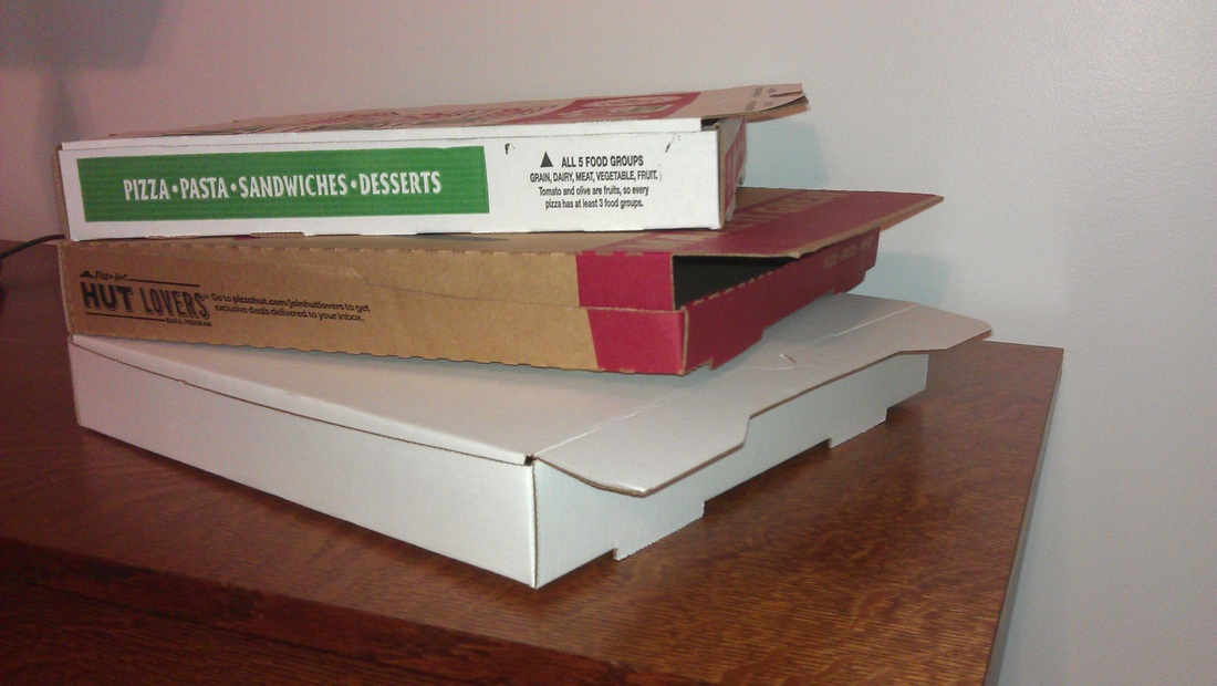
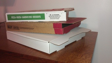 A collection of boxes from local shops led to some curiosity. I was trying to use an example with pizza box design in our polynomials unit, but needed to cater to (yes, pun intended) the visual learners in the room. So, off I went to play the teacher card and ask for an unused medium box from several places to see if one store held an advantage over another size-wise. Of course, the shops obliged, so I should give a shout-out here to Pizza Hut, Gambino's Pizza, and Wheat State Pizza. I hope to time this to influence a bit of Super Bowl ordering hysteria, but a math teacher's endorsement is probably not big on their respective radars, let's face it. Focus your attention, though, on the center box in my photo. It seems to have a chunk missing out of that front edge, no? That box belongs to Pizza Hut, called their new Eco Box, and had previously included some text on the box boasting it would "keep tons of cardboard out of landfills annually." Of course, the math teacher in me wanted to quantify just how many tons of cardboard they were talking about.
 Old Pizza Hut box. Click image for source link. I also must disclose, a significant amount of my information and some graphics came from a blog post on Chainalytics' website written by Rich Lindgren as well as a post of the same article on Packaging Matters' blog. They begin by taking note of Pizza Hut's previous box design. Nothing out-of-the-ordinary. Just a standard, rigid, corrugated cardboard pizza box. As a math teacher, if you have not unfolded one of these boxes to show how the volume of the box can be shown from its flat template, I highly recommend it for the sake of the visual learners in your class. Label the height of the box as " ( x )" and the subsequent size of the width could be described as (16 - 2x) with respect to the overall width of 16 inches for the template less x inches for the left and right edges, and the length as (32 - 3x) / 2 to account for the front edge folding over itself and the back edge of the box. Showing students that the volume of the box, V = x (16 - 2x) ((32 - 3x)/2) , has many values has led to interesting conversation for me but mainly drives at the inquiry as to why the maximum volume is NOT utilized, which lends to the idea of perhaps rephrasing the function so that we can more easily state that the base must remain a square. If you have suggestions on this, please include them in the comments below.
 The Pizza Hut Eco Box. Click for image source link. Anyhow, enter the Pizza Hut Eco Box. Again, nothing out-of-the-ordinary at first glance. But that front edge is different than your average pizza box, actually it is half the height of the front edge but does not hamper the box's performance at all.
Earlier versions of this box claimed they would "keep tons of cardboard out of landfills annually." My skepticism got the better of me, so here I am writing a blog post about it.
 Box flat comparison. Click image for source link. Turns out, that little missing strip of cardboard really has a big impact when extended upon Pizza Hut's annual sales projections. Packaging Matters' blog post saved me some time in calculating, and visualizing, those figures. Okay, I'm buying into the "tons of cardboard" savings claim now, because I realize Pizza Hut is a pretty big player in the world of pizza. Plus, this visualization also gives me yet another example in calculating percent change, which are fun to accumulate.
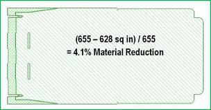
 Visual of annual cardboard conserved. Click for image source. Quoted straight from the Packaging Matters blog post: Now 4% does not seem like a huge number, but at Pizza Hut USA volumes (estimated 675,000 boxes per day), that is an annual reduction of over 46 million square feet of corrugated board. To put that in perspective, that would be an NFL Football Field w/o end zones over 128 feet high.With an estimated half-cent savings per box, it is not likely to come with a price drop on their menu, but the cost savings the company will incur is likely to be in the millions of dollars. And while only shaving off about two inches of space these flat boxes will occupy on a stockroom shelf is not a substantial victory in clearing kitchen space, it is indeed a case of "less is more."
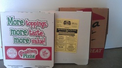 Again, I want to thank local pizza shops Pizza Hut, Gambino's Pizza, and Wheat State Pizza, for allowing me to play the teacher card and get a "free" box from them. I'm sure they are going to get some business out of me in the future. And while I'm at it, I'd be remiss if I didn't tell you that their stuff is worth a try, if you are in the are. Also, I tried to time this post on Super Bowl Sunday, the capstone of the week with the most pizza purchasing power annually (an anticipated 4 million pizzas purchased in 2012, not including homemade pies or frozen pies). I'm not trying to soak up any spotlight, but figured it was appropriate timing for this topic. And just like the rest of you, I'm rooting for Coach Harbaugh's team. --Keltner--
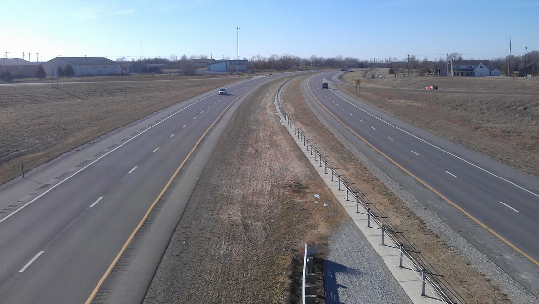
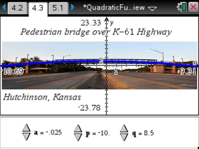
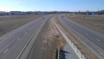 A view overlooking Kansas Highway 10 through my town. Give them something they can relate to in real life, right? Well, quadratic functions have numerous applications (most noteably Dan Meyer's basketball shot example using the 3-Act structure) but some are a stretch of the imagination for most algebra students. I don't think I knocked one out of the park on this activity, by any means, but it definitely had students engaged and talking. To elaborate on the picture at the left, our town is working on a grant application through the Kansas Department of Transportation to install a pedestrian bridge over Kansas Highway 10 and seeking community support for the project. You'll understand why this pedestrian bridge relates to the lesson shortly, I swear.
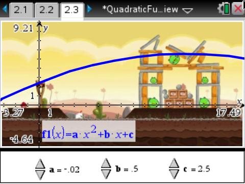
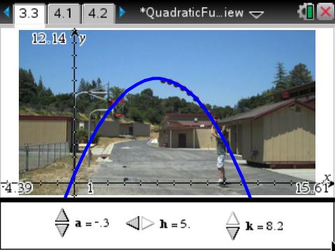
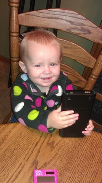 My 2-year old daughter & TI-Nspire CX. I used the TI-Nspire CX handhelds available to my classroom and was able to import pictures of objects that stressed the properties of quadratic functions in standard, vertex, and intercept forms each with a different context that I felt emphasized the form students were focusing on. (The .tns file for the activity can be downloaded HERE) Standard formThe y = a*x^2 + b*x + c form (yes, this post is letting me see how little formatting I can do with text on my blog), is where our focus began in our quadratics unit. I related this form to the path seen in Angry Birds (shown in the screenshot album below) since the path of the previous shot was visible on screen. I set up sliders to allow students to modify values of a, b, and c and watched them try to map the previous shot they saw. Some comments I heard: - "Dude, you gotta change c so it's your y-intercept to put the bird in the slingshot!"
- "Yeah, a has to be negative so it's concave down, but make it barely negative so the graph gets wider! Duh!"
- "Whoa, changing the value of b only swivels the graph from side-to-side!" (this was important as we worked later in the unit to factor quadratics)
Most importantly, students were able to connect each constant (a, b, and c) to its unique impact on the shape of the graph, on their own terms--I just used Angry Birds to facilitate the process. The students carried their momentum into Vertex form next. Vertex formThe y = a*(x - h)^2 + k form, where the vertex is located at (h, k) was a fitting place for me to use Dan Meyer's basketball shot example , because students thus far were struggling with the idea of why symmetry was important in quadratics. They had already aced the idea of wider/narrower graphs and how that was critical to the graph's shape, but I used this to emphasize how each point on one side of the vertex also "secretly" corresponded to another point on the opposite side of the vertex. Intercept formThe y = a * (x - p) * (x - q) form that is shown many different ways in many different textbooks. This was going to be the grand finale, bringing in the pedestrian bridge project I'd mentioned earlier (the public information presentation can be found HERE, if you want to know more). I included an example photo of a pedestrian bridge in our state (over Kansas Highway 61 in Hutchinson) and students fit the graph by noting the x-intercepts on the scale that was overlaid on the photo. (Side note: they could also manually enter a value for the constants, they did not need to manually adjust values as small as shown). Several students also asked about why the towers at each side of the pedestrian bridge had to be so tall, which led us into a side discussion about height clearance and its importance to road traffic that would travel beneath (a decent review of inequalities).
So, as I was arriving at school the day after doing this lesson, the school secretary told me how cool it was to hear about my lesson at the Site Council meeting the night before. Apparently, my principal talked up the lesson during the public informational meeting THAT night in front of city administrator and some other city staff involved in the project, as well as numerous citizens in attendance. So, I received a couple emails that next day from several people expressing their thanks for having beefed up support for the project while also teaching the concept of the bridge in class. It's fun to have those "I wish my math teacher did things the way you do" moments, with the idea that parents who were at that meeting probably gave their students a pop quiz when they got home without my prompting. Sorry about that, kids. I'd mentioned a link for the TI-Nspire activity earlier, but HERE it is again if you want to use it or modify it for your own use. Even if you don't have a TI-Nspire handheld, you can give it a test-drive using the TI-Nspire Document Player HERE (open the Doc Player first, then download the activity and open it through the Doc Player interface). --Keltner--
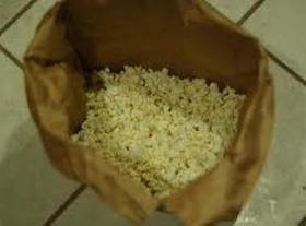 Grandma made PLENTY of popcorn when we visited. Consider this example, that might very well appear in a math textbook:
How long would you leave a $50 investment in a bank, with 2% interest, compounded annually, to yield a balance of $500?
Applicable, yes, but how enticing is it, really?
My grandmother passed away several years ago, and I miss her plenty. I'm certain my daughters would have enjoyed meeting her and hearing some of her stories, too. Or the way she could teach a new card game almost every time I went to visit her.
One of my favorite memories of visiting Grandma's house was how she would make enough popcorn to fill half a paper grocery bag, then keep it warm in her stove. And she was always generous in using salt on her popcorn, which I consider an extra perk.
 Grandma What really got me thinking, though, was when my parents told me they had found some savings bonds at Grandma's house and bank that were in my name, dating back to just after my birth. Grandma never brought it up to me, nor did she bring it up to my parents. This generous act on her part gives rise to the name of my blog: Good for Nothing (see blog post HERE about the relevance of the name). Grandma made a grand gesture with no expectation of recognition or grand reward in return. She truly did something good, for nothing in return. The math teacher in me can't leave this alone though. Knowing the end balance of these savings bonds' values, I'm curious about what the interest rate was, but realize that Grandma kept adding to the collection of bonds, which would make this more of a recursive function. Nevertheless, I greatly appreciate her generosity, even long after she left this world. It definitely makes for a great Act 1 in the 3-Act lesson format, and I'd love to figure out how to get through Act 2 to find the result in Act 3, but am uncertain as to where to go next. This might be a better example to leave to rest though. Take a moment with your Grandma next time you are with her. She just might bless you with this sort of curiosity someday like mine did. --Keltner--
 An EHS student and KDOT official interact demonstrate the Airspace Awareness Tool. Here's a conundrum being faced in the state of Kansas: harnessing the state's great potential for wind energy while also safely advocating for aircraft traffic servicing the state's 138 airports and abiding by the siting guidelines for industrial wind turbines. The state of Kansas approved a landmark piece of legislation in 2009, the Kansas Net-Metering and Easy Connection Act, which not only allowed for citizens to connect their energy generators to the grid but also standardized a 1-to-1 buyback policy (they would earn credits from their utility provider at the same rate that they would purchase energy from the same provider). Here's where the math comes into play: industrial wind turbine installations are subjected to a battery of governances before the FAA (Federal Aviation Administration) gets their chance to have a say. Wind farm developers would then submit their site proposal through the FAA's Obstruction Evaluation process. Affected projects would include: - Any construction or alteration exceeding 200 feet above ground level (which requires a lighted beacon to make it visible to aircraft, common on water towers in my area)
- When requested by the FAA (and sometimes as an anticipated last step in the developer's proposal process, which can negate a substantial amount of work, just to have to start from square one because the project might interfere with safe air travel)
- Any construction or alteration located on a public use airport or heliport regardless of height or location
- those located within 20,000; 10,000; or 5,000 feet or public use or military airports at varying height levels depending upon proximity to those airports (THIS is where the lesson focuses, on how to visualize these criteria before the FAA comes a-callin')
These criteria hardly lay out like a list of constraints for linear programming or a system of inequalities, but the logic involved definitely could be used in the same breath as one another. Try some of the requirements in the applicable city ordinance in trying to obtain a wind turbine on our high school campus, as part of the Kansas Wind for Schools program: - Blade-tip clearance, at its lowest point, shall have a ground clearance of not less than 25 feet tall
- Overall height of 60 feet or less to fit Micro-WECS (Wind Energy Conversion Systems) class of devices
- Minimum setback (measured from the closest adjacent lot line or parcel line or above ground public utility) of 110% of the device's overall height [Example: a 50-foot tall turbine would need to have a 55-foot radius clear of it to the nearest property line or easement]
- No buildings within 110% of the device's height where the turbine's collapse could potentially damage another building of the property owner's
- Ensuring that the noise emitted from the wind turbine shall not exceed 50 dbA within 100 feet of the nearest property line, except during short-term events such as utility outages and severe windstorms. [NOTE: The math involved with decibels is a great application to logarithms and how exponential behavior applies to the height-noise relationship in this case]
Do the phrases "not less than", "within", "n feet or less" start looking like the real-world examples we would hope to incorporate when teaching systems of inequalities? This gives students not simply an opportunity to see that our turbine site is a solution to the system of inequalities, but can drive some curiosity as to where else a turbine might be positioned and still satisfy all these criteria. Check the brief video tutorial below on how to use the Airspace Analysis Tool (link to actual site included HERE), a product of the Kansas Department of Transportation Division of Aviation in conjunction with Burns & McDonnell Engineering (Please note links on the User Agreement page that help out with loading the Google Earth Plug-In necessary to use the site. From past experience, this has not been as successful using Safari as it has on Chrome, Fireforx, and Internet Explorer).
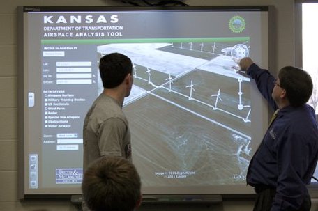
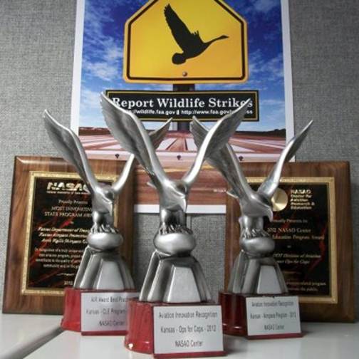
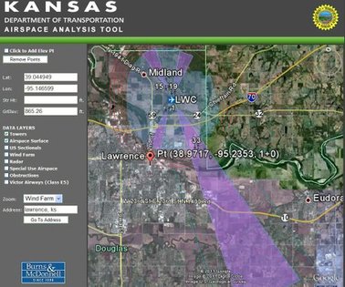 A screenshot from the Airspace Analysis Tool, near Lawrence, Kansas. Now, the fun, behind-the-scenes news about all this: KDOT actually unveiled their Airspace Analysis Tool IN MY CLASSROOM at a press conference hosted on a teacher inservice day (i.e. supposedly no classes in session). Here's the news story from the Lawrence-Journal-World.Their personnel said it would be nice if we could have some students available to play around with the project and give their candid feedback. To their chagrin, I almost needed to bring in more chairs! Thank goodness some of the media on hand chose to stand and work behind their tripods and cameras, to catch the multiple perspectives of KDOT staff and students interacting. Students were anxious to see their project because it touched on a topic they had some curiosity about, and liked the potential to see some engineers in action. To show up at 8 a.m. ON THEIR DAY OFF was a remarkable thing for them to do and made another tally mark in the column for times I've loved my job.
 Situation hopefully made safer by the KAAT. Click image for image source link. While students had an opportunity to try out and manipulate the tool during our press conference, they investigated the maps with relative ease because of their awareness of the familiar interface, Google Earth (even mentioned on the Google Earth blog after its release for an innovative use of their software). When the folks with Burns & McDonnell and KDOT asked for feedback on the beta version they released, our students swung for the fences and suggested another visual aspect: avatars. So now, the KAAT includes superimposed images of the device proposed at a location, as well as for existing structures on file. For those in the aviation industry, as well as in the land development and construction industries, this has been a welcome addition. As mobile devices become ever-present around us, this interface very well could find its way being incorporated into the cockpits of aircraft to help with flight instruction feedback in real time. Since its release, the Kansas Airspace Analysis Tool (KAAT) has garnered national attention for its innovative ideas and interface, not simply for helping wind energy developers but also companies and communities who are looking to install water towers or cell/communications towers. Here is part of one announcement I was able to retrieve ( and HERE is a copy of their online newsletter announcing the recognitions), touting the acclaim that the KAAT has received:
 Some of the awards received presented to the KAAT project. - For the first time in the history of the National Association of State Aviation Officials’ Awards, a single state received both the State Most Innovative Program Award and the NASAO Center Outreach and Education Award for two separate programs. The State Most Innovative Program Award was presented to the State of Kansas for the Kansas Airspace Awareness Program - Aeris Vigilis (Airspace Guardian). The NASAO Center Outreach and Education Award was presented to the State of Kansas for its “Ops for Cops” program. The program partnered KDOT, the Transportation Security Administration, Drug Enforcement Administration and airport managers to provide tactical and legal information for law enforcement officials called to airports. Kansas also received a national best practice recognition for its continuing legal education program in partnership with the Kansas Commission on Aerospace Education.
- The KDOT Aviation team received word that the Kansas Airspace Awareness Tool, a major component of the Airspace Awareness Program, will receive the American Association of State Highway and Transportation Officials (AASHTO) President’s Award for Aviation in November. The Tool was recognized in April by the American Council of Engineering Companies with an Engineering Honors Award.
Since the unveiling of the Kansas Airspace Analysis Tool at our school, student have made contact with some of the personnel on hand for this event and gained insight into numerous STEM-related paths that could potentially open other doors for them later. My favorite experience from all of this comes from a comment a student shared with me a few weeks later: "Mr. Keltner, you know those algebra problems with the 'a plane flies with the wind between towns in 2 hours but the return flight takes 3 hours because it's going into the wind?' Well, Mr. Young from KDOT took me up in a plane and let me try the controls for a bit and I looked at my clock and could SEE that problem playing out along our trip as it was happening!"So, I hope you enjoy this potential class project you can utilize. Granted, it is for the state of Kansas, but I think the technology and the ease of integration into class speaks well for student engagement and enjoyment. I know my students have enjoyed it and have bragged to me about being able to put a 2,000-foot tower in their back yard. I guess that goes to show you, the sky is the limit. Only in this case, they can actually SEE it. --Keltner-- One last shout out to the folks at Burns & McDonnell and the Kansas Department of Transportation Division of Aviation, namely Director of Aviation Edward Young who gave our students a wonderful opportunity when he selected our school for the unveiling of his project. Thank you for allowing us to be a part of this project.
 In the spirit of Black Friday, let's see if we can save some green. Whether you are guilty of joining the Black Friday "festivities" or not, this lesson contains something for you to be aware of in your shopping with coupons.
If you have multiple coupons, of different discount types (amount discount vs. percent discount, that is), then there is a particular way to apply these savings that will earn more savings than the other.Long story short: Apply the percent discount before applying the amount discount for more savings.
The concept relies on the concept of composition of functions, commonly written in the form f(g(x)). These are functions that evaluate in one functions and then another, in a particular order. The topic puts emphasis on evaluating with the order of operations as well as other properties like the commutative property and associative property, both of which are staples in algebraic concepts.
 Remember, always use the percent discount FIRST when given the opportunity. Teaching this lesson in class works well, mainly due to the fact students get so wrapped up in seeing whether they know how to reap the biggest reduction on their purchases in the future. To help solidify their learning, or ward off skeptics on the topic, we try a couple examples: a $50 purchase and a $100 purchase, for ease of computation. Follow along: For a $50 purchase:- $10 discount applied first: $50 - $10 discount = $40, then $40 - (0.2)*$40 = $32 final price
- 20% discount applied first: $50 - (0.2)*$50 = $40, then $40 - $10 = $30 final price
For a $100 purchase:- $10 discount applied first: $100 - $10 discount = $90, then $90 - (0.2)*$90 = $72 final price
- 20% discount applied first: $100 - (0.2)*$100 = $80, then $80 - $70 = $70 final price
It is no strong coincidence that there is a two-dollar difference between these scenarios. This is the critical piece of what I'm trying to convey with this post (oh, and it's a fun math lesson to teach). In using the dollar-discount first, the consumer or retailer is causing the percent-discount to be applied to a smaller value, therefore not letting it stretch as far as it could otherwise. It is, in essence, as if you are also taking the percent OFF of the dollar discount you wish to use (note the examples above, where there is a $2 difference and $2 is 20% of $10). In applying the percent discount first, your percent covers the larger original purchase price and stretches further. This is the gist of why the percent coupon should be applied first, when you have the opportunity. NOTE: Some retailers have a point-of-sale system which is programmed to use the dollar discount first, no matter when you had a coupon to the cashier, so you might be forced to play their game and sacrifice part of your savings. I will not name names, but have had a couple of disappointed students bring in receipts and show me how much MORE they could have saved if the register didn't force the order of discounts applied. I'm making a bunch of links in this sentence if you would like either the TI-Nspire file I have shown up above in the slideshow, or the original presentation and handout I did for this topic to earn T^3 Instructor status a few summers ago. (Don't have a TI-Nspire? Try running the TI-Nspire file through the TI-Nspire Document Player without a need for download of software.)
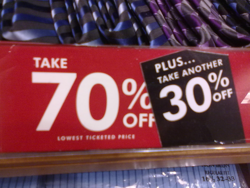
 A 101qs.com entry I posted in May, 2012. This was a head-scratcher but good example. I managed to take a trip to an outlet mall, where I saw a curious sale display, pictured at left. To use the word "PLUS" in this instance seemed additionally confusing (yes, pun intended there), and caught the ire of Dan Meyer on his blog shortly after I'd posted the photo to 101qs.com. This, and other sale opportunities like it have been a common cause of commotion in class among my students who have heard me teach this lesson. They are able to bring up new shopping adventures they have had, where they might have corrected the way a cashier had rang something up, or a discount was applied more favorably than they expected, or the discount merely balanced out the sales tax they would have paid anyway. Regardless, the lesson sticks. Applying similar, consecutive discounts have proven to be a decent introduction to exponential growth, since students are aware that "50% off, then another 50% off does not make the item FREE." For those students who are very shopping-savvy, these applications hit home for them much more quickly than any compound interest problem ever could. Speaking of interest, I hope this sparked some of yours. Have a good day and enjoy the holiday season, saving all the while! --Keltner--
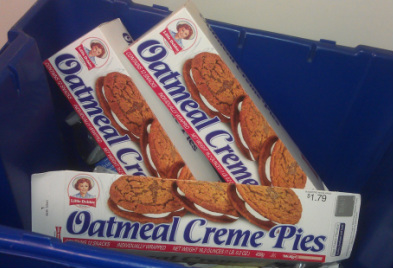 The "after-math" of introducing systems of equations. Delicious pun, huh? Introducing systems of equations about the same time of year as Halloween candy flows freely can be dangerous. I tried to use students' sugar cravings to introduce the topic in class though. I have a sweet spot for Little Debbie's Oatmeal Creme Pies and noticed a peculiar pricing setup betwixt their Single Decker and Double Decker snacks. At a budget-friendly price, I was able to bring snacks for my students to help solidify their work on the example we posed to introduce systems of linear equations. Gimmicky, I know, but it definitely grabbed their attention, wondering why I brought snacks that day.
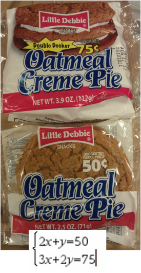 The rest of the example relied heavily on the photo at left, which showed two different "recipes" of Oatmeal Creme Pies available at our local convenience store, one the traditional Single-Layer-O'-Creme and the other the legendary Double Decker. This gave students a familiar context and placement of the example and led to a pretty casual conversation that was more engaging than cracking open the textbook, without a doubt. We investigated several things about the snacks: - Does the weight matter for the price (hinting at a use of direct variation which we had studied previously)?
- What are the things about the snacks we CAN change and which things are non-negotiable? (i.e. what are our variables and our constants in this scenario? I was proud they got this outlined so quickly.)
- Is there a more efficient way to solve for the cost per cookie layer and cost per creme layer?
So, with hook baited, we entered into the strategies for solving linear systems of equations, notably in this instance the substitution method. We set up the system of equations at the bottom of the graphic at left and solved, arriving at an astonishing revelation: The creme layer costs ZERO cents!(The cookie layer costs twenty-five cents, as we discovered.)Students had a hard time wrapping their heads around this, thinking more of the context or production costs until another classmate emphasized that our goal was to figure out the PRICE for each cookie and creme layer, not the COST.This was a decent introduction to the idea of a solution for a system of equations, because students emphasized to one another that zero cents for a creme layer did not make much sense on the surface, but the pricing structure we solved for WORKED with the label price of each snack (made a true statement). When I had to back up and give a concrete definition for what a solution to a system is, students had already seen it used in context and had a more concrete understanding of how it worked in the abstract sense of the topic.I hope you enjoy this example as much as my students did. Without a doubt, timing during the school day was critical with this example. Oh, a side note: I did not use the Oatmeal Creme Pies as pictured; I bought 12-packs that were a bit smaller but still grabbed students' attention just as well. For now, I need to run. Just reflecting on this lesson is making me hungry.
--Keltner--
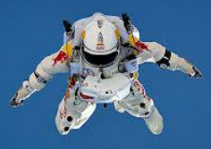 Click for Red Bull Stratos mission website. For the casual observer--well, hang on--no one casually observed Felix Baumgartner's jump from the edge of space on October 14th, 2012. Not everyone who watched had their mind racing like mine was, but I am certain that this feat is one more than befitting of #101qs and #3Acts formatting. What follows on this post is what I have managed to use in my own class to help quench students' curiosity about the Red Bull Stratos project, which sent a helium-filled balloon up to 128,100 feet and had Austrian skydiver Felix Baumgartner jump back to the Earth wearing a pressurized suit.
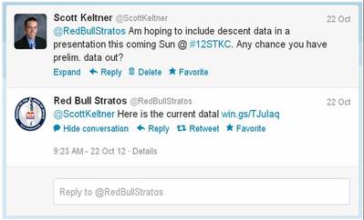 I got a response back from Red Bull Stratos! This coming Sunday morning, I will be presenting at the STEMtech Conference in Kansas City and was hoping to use an example from the Red Bull Stratos jump within my talk to show how velocity, acceleration, deceleration, and time can relate to one another--both for the balloon's ascent and Felix's descent back to the Earth. So, I tweeted the Red Bull Stratos folks. With 240,000+ followers, I figured it had fallen on deaf ears (although, since they're used to travelling faster than the speed of sound, they could use "I couldn't hear you" as a valid excuse). Nevertheless, I set out to collect some data points for use on the TI-Nspire CX using the Teacher Software. Below is a slide show of some of the work I completed. What I hoped students would take away from these graphs included: - The balloon appears to make a fairly constant ascent, but careful inspection would reveal the upward velocity of the balloon actually varied much more than at first glance.
- Does the elevation vs. time graph of Felix's descent convey enough information for us to know when he deployed his parachute? (This would be a great time to introduce the idea of a secant line to students, as a BRIEF introduction to a Precalculus and Calculus topics such as average rate of change and limits)
- Does the velocity vs. time graph of Felix's descent show enough to let us identify when he is accelerating and decelerating, when his parachute was deployed, and when he touched earth again?
Also, I'm including a link to the data I used to compile this activity on this post both as a Google Docs Spreadsheet and a Microsoft Excel file, and also the TI-Nspire CX document used here (this can be downloaded, then viewed within the TI-Nspire Document Player without needing software purchase or download of trial versions). Please use either however you see fit and let me know how it works for your class. The ascent data was gathered from this post on Wikipedia. The descent data was gathered by watching and pausing this YouTube video a couple different times (NOTE: these were approximate velocities and subject to verification and should not be considered 100% accurate, but did work well enough to conduct the lesson I was looking to convey).
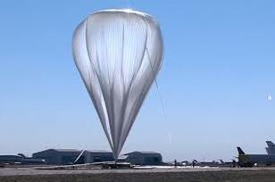 Click for more information on the Red Bull Stratos balloon. The other information I wanted to include in this lesson, but did not focus on in this lesson, included facts and figures about the balloon used in the Red Bull Stratos mission. At lift-off, the balloon was nearly 200,000 cubic feet (or 100,000 Giant Jenga games, as I was able to illustrate with my students in class, since we recently worked with it). At its highest point, the balloon was nearly 30,000,000 cubic feet large (which I related to my students by having them envision a cube that is as long, wide, and tall as a football field--a cube with side lengths about 310 feet on a side). Check this blog post on how the balloon compares with the Statue of Liberty When we approach a lesson that involves transformations of solids (impact on volume and surface area when a single dimension is altered), I will likely revisit this topic again with a different focus in mind. As much energy as my students brought to this lesson, then finding out that there were over 8 MILLION simultaneous YouTube viewers of the Red Bull Stratos mission (which was not mentioned on the mission's blog post among the other records and noteworthy feats achieved), I knew that this was a topic that would grab their attention. I also know how much my own mind was racing as I was watching the broadcast of the mission, so to leave it alone would be unheard of. But when the speed of sound was broken during the fall, that is the play on words I was hoping for: "unheard of." Mission accomplished. Thank you for being a great example to our students, Felix Baumgartner! Wait! An example in a lesson, I'm not saying that all our students should go jump in balloons and take up this sort of skydiving! There. I have to cover that segment of the population that will try and one-up this record by any means necessary. --Keltner--
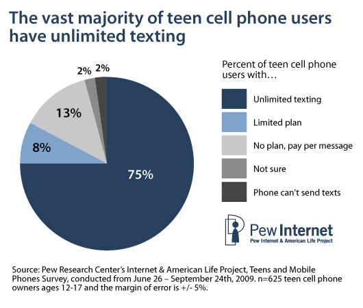
 OMG, Unl. TXT FTW!!! I like how this site uses a question posed by a student, akin to "How do I graph a function that has a changing slope?" The example quickly divulges to cell phone pricing structure, a valid place to go The issue I have with their example is that the majority of my students who have cell phones and an awareness of these pricing structures realize quickly how outdated the example is and lose engagement in the class discussion. Cell phones make calls, true; however, the majority of the usage my students' phones see is by text messaging, which most of them have a HUGE allotment of messages per month by their phone plan (many of whom will have unlimited texting anymore). So while the cell phone pricing examples are valid examples to introduce piecewise functions in a context familiar to students, they are quickly outdated by the rapidly changing face of technology today. The Khan Academy example I found that lends itself to piecewise functions takes almost 3 minutes to get the example drawn on the screen (while Sal says twice "I hope I'm not boring you while I'm drawing this" and also "I really should have something that lets me just get the graph image in place quickly"). I have to be a bit lenient, though, because his video was posted in 2007 which is better than I was doing back then (I was, however, using a SMART Board regularly in daily class activity though and feigned a couple efforts at uploading my stuff). Students become quickly detached from examples in their textbook and I would have a hard time justifying asking them to watch a 9-minute KA video where the first 3 minutes are setting up the example.
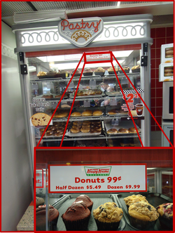 I visited the convenience store in town and compiled this photo (the one pictured above left) of their donut case, which indeed exhibits the characteristics for a piecewise function (while also allowing us to discuss the greatest integer function, since we can only purchase whole number quantities of donuts). I simply project the image in class when they come in and have already set the scene for the lesson, despite having to address the "So, we're taking a field trip today?" and "Did you bring snacks?" comments from students as they arrive. [NOTE: The amount of time showing this image in class should be inversely proportional to the amount of time to the nearest meal for your students.] Have students create a price table for the quantity of donuts purchased, from 0 to about 15. They get an interesting surprise around the dozen-donut mark (namely that 11 donuts costs $10.44 and 12 donuts costs $9.99--so it is as if the 12th donut earns you a $0.45 refund!). These sort of conclusions are ones students treat as an inside joke among their other classmates, so don't sell it short despite the nerdiness it entails. Since we're supposed to help our students make real-world connections, this is a prime example--and a delicious one, to boot.
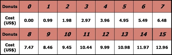 Krispy Kreme price chart. Have students construct it and see if they notice anything around the dozen-donut mark. In the video examples I complete below using foldables, I try to emphasize that each of the PIECES of the function could stand alone by themselves with no restriction on their domain(s). With a piecewise-defined function, we are merely piecing together the parts of the individual functions that are requested in the piecewise function that DOES specify constraints on the individual component functions.
 This is the example worked out in the YouTube video below. A copy of the foldable used for a 2-piece piecewise function can be found HERE.
 This is the example worked out in the YouTube video below. A copy of the foldable used for a 3-piece piecewise function can be found HERE.
Obviously, I need to develop a better way to make a quick demo of lessons like this. These were each done on my iPad2, so I'm pretty pleased with the capability of them to collect decent sound and video. What I did not show were the cue cards I created for myself just behind the iPad so I could more quickly graph and plot the functions (something Sal did not do on his example I mentioned earlier). Oh, and I included a shout out to Vi Hart for having used Sharpies for both of the videos. So, I've got that going for me, which is nice. Piece, I'm outta here. Yes, I misspelled that. I meant to. Math puns are hard, I gotta take what I can get. --Keltner--
 Doctor-approved backpack weight? I came to our lesson on linear inequalities in two variables, which coincidentally closely follows our discussions on direct variation, scatter plots, and linear regression. I wanted to find a unique real-world application for the lesson that tied these two topics together. I found a blog post for the New York Times wellness section that gave a decent path HERE: the relationship between student body weight and their backpack weight. The American Academy of Pediatrics recommends the student's backpack " never weigh more than 10 to 20 percent of your child's body weight." Consumer Reports insists that a backpack weigh no more than 10% of the student's body weight (I feel it necessary to point out that the emphasis of their claim seemed to be focused on elementary school-aged students; their insistence seemed to loosen up on secondary students, citing that their back muscles are stronger at those ages and better fit for a bit more extreme load). So, enter the lesson, sans the lab coats and clipboards that the Consumer Reports folks might have access to, and determine: Are my students' backpacks in compliance with the most extreme of these doctor recommendations?
I've created several activities that are intended to accompany this activity. Here are some of them: - TI-Nspire CX activity [If you do not have TI-Nspire Teacher Software to open this file, download the file first, then use the TI-Nspire Document Player to view it without need for purchase or download] The activity will walk students through analyzing their class's data (NOTE: The teacher should note the slideshow at the bottom of this post for pointers as to how this activity is set up. Student weights are "hidden" on the first/title page of this document), as well as a couple of final Self-Check questions to conclude the lesson with a check for understanding.
- GeoGebraTube post for the graph and spreadsheet to display a class's data, showing the Compliant and Non-Compliant regions as they pertain to doctors' recommendations regarding this weight relationship.
Please note the slide show below for images of each of these activity resources with captions to help give pointers as to the intent of the activities as well as user tips and tricks. 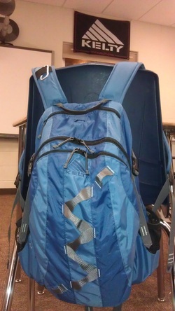 Some helpful tips on successfully executing this lesson: - Don't forget to use an accurate scale! I was able to call in a favor with our school's wrestling coach and use their official scale since this lesson happened to fall during their off-season. Especially helpful--since some students were bashful about their data being seen by others--was the fact that the scale had a detachable display screen which could be faced away from their peers.
- Yes, I indulged a bit when using the TI-Nspire CX's (especially since we actually were able to use the CAS version of them). They work great this early in the school year to grab students' attention and quickly engage them in a topic like this one. I otherwise would use a similar activity using the TI-84s we have access to.
- I do not mean to play down the power of GeoGebra in this post. It is a very visual tool and my students have enjoyed it in many other lessons, but it was dependent on me having contained my lesson within a separate file, in this case a PowerPoint. No big deal, but with a couple of network snafus among one of my larger class sizes, I revised last year's lesson plan to instead use the TI-Nspires this time around.
As for the photo at the left of my backpack and the banner above my classroom window (both KELTY, by no coincidence): there's no real rhyme or reason, I just wanted to give a shout out to the company. I still have students who believe I faked both products so that I could dub myself with a pretty sweet nickname. Well, who's laughing when my endorsement deal with them rolls in? Right? Hint, hint... --Keltner-- I mean, Kelty
|


 RSS Feed